Friday 15 October 2010
Thursday 14 October 2010


Tuesday 12 October 2010
Codes and Conventions For a Double Page spread in a Magazine

- 1 main image that stands out and is usually placed on the left of the double page to show the reader who the articles about.
- Drop quotes are usually used on the main image and are usually exciting or controvercial to grip the reader and make them want to read the article.
- Text is in size 11 and usually Ariel Font to keep consistency and continuity throughout the pages.
- A stand first is used which gives the reader an insight as to what the articles talks about.
- Bylines are put under images to give credit to the photographer or under text to give credit to the writer.
- The main image can bleed accross two pages to show consistency to the next page and also to make the page look a lot more aesthetically pleasing.
- The pages are Aesthetically pleasing to entice the reader.
- Lots of writing is used, which is usually in 3-4 columns.
- An informal mode of address is used to relax the reader.
- The theme of the two pages is kept consistent throughout to show continuity.
- The artists name is usually highlighted and in big writing to stand out to the reader and show them who the articles about.
- The page number, website and name of the magazine featured at the bottom of the page.
- Smaller images of artist are sometimes featured around the text.
Researching The Market Place
I have been asked to construct some research on existing music magazines and there features.
NME Magazine
NME magazine is different prices in different places in the UK it's £2.30 and in the US it's $7.25. NME put a new issue out each month which will contain information on music for the month, the average issue size of NME magazine is around 65 pages however it may change depending on how much information is needed to put in the magazine. NME magazine is focused mainly around indie/rock music and is targeted at lovers of them genre's. Nme magazine is published weekly to stay up to date with the music business.
http://www.nme-magazine.com/
Publisher: www.ipcmedia.com

Kerrang Magazine
Kerrang magazine is usually priced at around £2.30 each issue will have around 63 pages which may change depending on how much information is in the magazine. Kerrang magazine follows the genre of screamo/rock music and aim there magazine at lovers of these genres aged 16+. The new magazine is released weekly.
http://www.kerrang.com/
Publisher:www.bauermedia.co.uk
 Q Magazine
Q magazine is a very popular music magazine which is priced around £3.99 however special issues of the magazine will sometimes cost more. Q magazine is monthly and will usually have around 70 pages, it doesn't focus around a specific genre of music but writes about all music, new releases, gig information and basically everything that going on in the music business. they target there magazine at the older generation who are interested in all music.
http://www.qthemusic.com/
Publisher: www.bauermedia.co.uk
 Total Guitar
Total guitar is the worlds number 1 guitar magazine and is priced at around £5.99. The monthly magazine will usually have around 70 pages and focuses on mainly music and bands that have popular and more famous guitarists and show upcoming bands that play more classic rock and old style rock. they follow the genre of classic rock and all types of rock. Total guitar magazine is targeted at guitar lovers and aged 16+.
www.totalguitar.com
Publisher:www.futureplc.com

NME Magazine
NME magazine is different prices in different places in the UK it's £2.30 and in the US it's $7.25. NME put a new issue out each month which will contain information on music for the month, the average issue size of NME magazine is around 65 pages however it may change depending on how much information is needed to put in the magazine. NME magazine is focused mainly around indie/rock music and is targeted at lovers of them genre's. Nme magazine is published weekly to stay up to date with the music business.
http://www.nme-magazine.com/
Publisher: www.ipcmedia.com

Kerrang Magazine
Kerrang magazine is usually priced at around £2.30 each issue will have around 63 pages which may change depending on how much information is in the magazine. Kerrang magazine follows the genre of screamo/rock music and aim there magazine at lovers of these genres aged 16+. The new magazine is released weekly.
http://www.kerrang.com/
Publisher:www.bauermedia.co.uk

Q magazine is a very popular music magazine which is priced around £3.99 however special issues of the magazine will sometimes cost more. Q magazine is monthly and will usually have around 70 pages, it doesn't focus around a specific genre of music but writes about all music, new releases, gig information and basically everything that going on in the music business. they target there magazine at the older generation who are interested in all music.
http://www.qthemusic.com/
Publisher: www.bauermedia.co.uk

Total guitar is the worlds number 1 guitar magazine and is priced at around £5.99. The monthly magazine will usually have around 70 pages and focuses on mainly music and bands that have popular and more famous guitarists and show upcoming bands that play more classic rock and old style rock. they follow the genre of classic rock and all types of rock. Total guitar magazine is targeted at guitar lovers and aged 16+.
www.totalguitar.com
Publisher:www.futureplc.com

Music Magazine Initial Idea's
I have been asked to think of some initial ideas for my music magazine which i will be designing and producing for my main task.
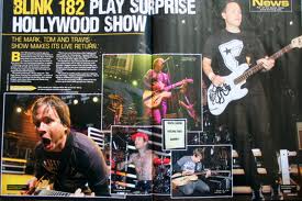
I have chosen to focus on a Alternative/pop punk genre themed magazine it will fetaure bands such as blink 182 and All Time Low. I will target my magazine at teenagers aged 16 to 20 as it will be easier to write for as i'm from that age group and because it is mainly teenagers who listen to my chosen genre of music.
I have chosen to focus on a Alternative/pop punk genre themed magazine it will fetaure bands such as blink 182 and All Time Low. I will target my magazine at teenagers aged 16 to 20 as it will be easier to write for as i'm from that age group and because it is mainly teenagers who listen to my chosen genre of music.
Monday 11 October 2010
Evaluation of My School Magazine
Looking back over my work i have completed for my preliminary exercise i am very pleased with it, i think if given more time i could of progressed my skills with the software used more and created the front cover and contents page for my magazine better. In many ways my magazine front cover follows the forms and conventions of a real magazine. The name runs along the top of the magazine as its the first thing the reader will see when they read the informations on the cover, also as the magazine isn't well known all of the title is on show so that the reader can see clearly what the magazines called. The front cover also feature both the website at the bottom of the page and a buzz word to show readers that the magazine is free, the theme and colour scheme of the magazine remains consistent throughout the pages and the front cover has just one mains image with text running down along side the image on either side in columns.
My contents page also follows the main conventions of a contents page in many ways, it has just one main image which also features on the front cover and then there are smaller images around the page that link to the feature articles. As the contents page was made using Quarkxpress there is a perfect margin around the page because i had a grid to follow on the page which i used, all the text runs in columns down the page and there are page numbers which link to feature articles. There is also a list of articles which will be in the magazine which runs down the left of the page.
I used mainly 2 different types of media technologies in the construction of my front cover and contents page. For my front cover i used photoshop to construct it, i found this very easy as i have used the software before in a previous art graphics GCSE course so i can easily use the shortcuts to speed up processes so i had a slight advantage over some people. i used photoshop to construct my title and use the "texturizer" tool to make it look unique to my magazine, i also used Adobe Photoshop to edit my main image For my front cover and used the dodge tool to fade out the books in the background slightly and bring focus to the pupil holding the GCSE Success booklet.
I think both software are very effective at helping construct magazine pages however i found Adobe Photoshop a lot easier that Quarkxpress as the tools are easier to follow and it is easier to manipulate images using it however it can be difficult to layout pages using Photoshop. I think Quarkxpress is better than Adobe Photoshop for helping you layout the pages as it provides templates and guidelines which give you something to stick to but it can be very difficult to follow as the tools are not very well set out so it takes some time to work out what everything is.
Finished Contents Page of My School Magazine

Finished Front Cover of My school magazine

I created my front cover for my school magazine using Adobe Photoshop. I found it really easy to use and didn't have any trouble whilst making the cover.
Subscribe to:
Posts (Atom)